When it comes to creating a home environment that is both aesthetically pleasing and functional, the color of your furniture plays a significant role. For those who embrace a minimalist lifestyle, the choice of color can further enhance simplicity and ergonomics in your living space. This blog will guide you through selecting furniture colors that promote a sense of calm, reduce visual clutter, and support ergonomic design principles.
The Importance of Color in Minimalist Design
Minimalism is all about reducing excess and focusing on the essentials. The color palette you choose for your furniture can have a profound impact on the overall feel of your home. Here’s why color matters:
- Creates a Sense of Calm: Neutral and soft colors tend to create a peaceful atmosphere, which is central to minimalist design.
- Enhances Space: Light colors can make a room feel larger and more open, while darker colors can add warmth and coziness.
- Reduces Visual Clutter: A cohesive color palette prevents visual distractions and creates a harmonious look.
Best Colors for Minimalist Furniture
White
- Why It Works: White is the quintessential color for minimalism. It reflects light, making spaces feel larger and more open. It also provides a clean, crisp backdrop that allows other elements of your decor to stand out.
- Ergonomic Benefits: White surfaces can enhance concentration and clarity, ideal for workspaces and study areas.
Gray
- Why It Works: Gray is versatile and can range from light, airy shades to darker, more dramatic tones. It pairs well with almost any color and adds a sophisticated touch to minimalist interiors.
- Ergonomic Benefits: Soft gray tones are easy on the eyes and can reduce strain, making them suitable for furniture in reading or relaxation areas.
Beige
- Why It Works: Beige is warm and inviting, adding a sense of comfort without overwhelming the space. It works well with natural materials like wood and stone, enhancing a minimalist aesthetic.
- Ergonomic Benefits: Beige tones create a relaxing environment, which can be beneficial in living rooms and bedrooms where relaxation is key.
Black
- Why It Works: While black may seem bold for minimalism, it provides a striking contrast that can define and ground a space. When used sparingly, black adds depth and elegance.
- Ergonomic Benefits: Black furniture can anchor a room, providing stability and a focal point, which can be particularly useful in larger spaces.
Soft Pastels
- Why It Works: Pastels like soft blues, greens, and pinks introduce subtle color without overwhelming the senses. They add a touch of personality while maintaining a minimalist vibe.
- Ergonomic Benefits: Pastel colors can have a calming effect and are often associated with tranquility and well-being, making them ideal for bedrooms and relaxation spaces.
Combining Simplicity and Ergonomics in Furniture Design
Beyond color, the ergonomic design of your furniture is crucial for comfort and functionality. Here’s how to combine simplicity with ergonomics:
Ergonomic Chairs
- Color Choice: Opt for neutral-colored ergonomic chairs that blend seamlessly with your decor. Look for chairs in white, gray, or beige.
- Features: Ensure the chair has adjustable height, lumbar support, and a comfortable seat cushion to support good posture.
Desks and Workspaces
- Color Choice: Choose desks in light colors like white or soft gray to create a bright, focused work environment.
- Features: Look for desks with adjustable heights or standing desk options to promote movement and reduce sedentary behavior.
Sofas and Lounge Areas
- Color Choice: Beige and gray are excellent choices for sofas as they provide warmth and comfort without being too bold.
- Features: Ensure sofas have supportive cushions and adequate back support to promote relaxation and comfort.
Storage Solutions
- Color Choice: Opt for white or light-colored storage units to maintain an open and uncluttered look.
- Features: Choose storage solutions with ergonomic handles and accessible heights to ensure ease of use.
Practical Tips for Choosing Furniture Colors
- Create a Cohesive Palette: Stick to a limited color palette to create a cohesive and harmonious look. This reduces visual clutter and promotes a sense of calm.
- Consider Natural Light: Light colors work well in rooms with plenty of natural light, while darker tones can add depth to spaces with less light.
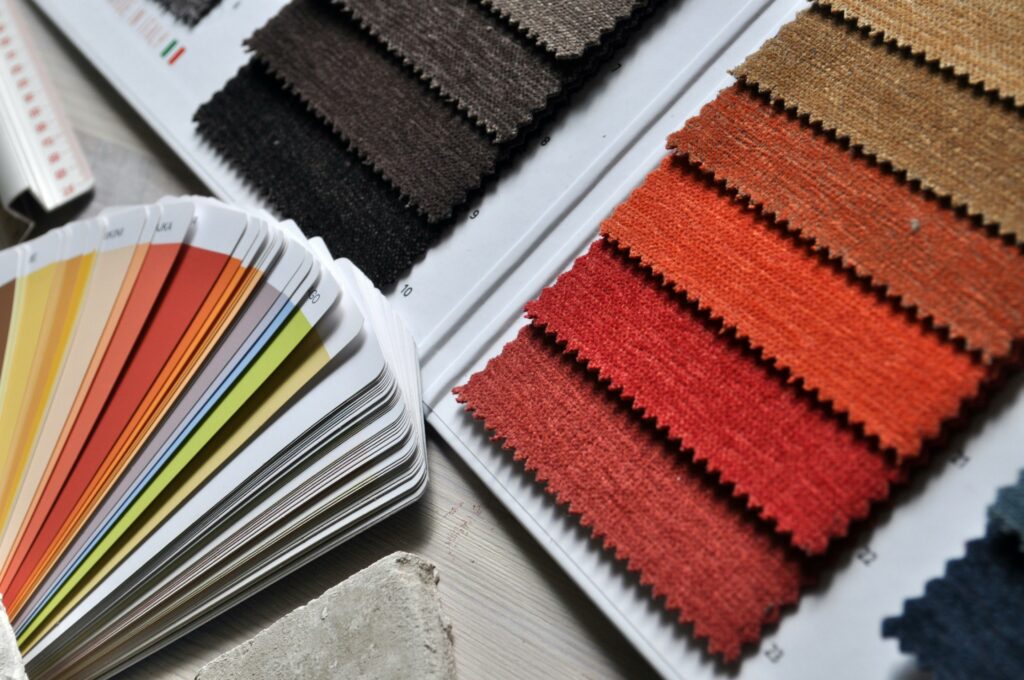
- Test Before You Buy: If possible, test paint samples or fabric swatches in your home before committing. Lighting can affect how colors appear, so it’s essential to see them in your space.

